Nirah
App Design | Branding
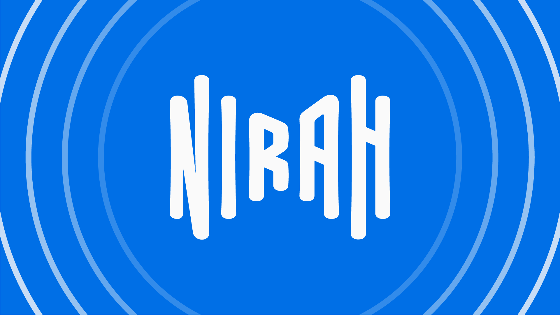
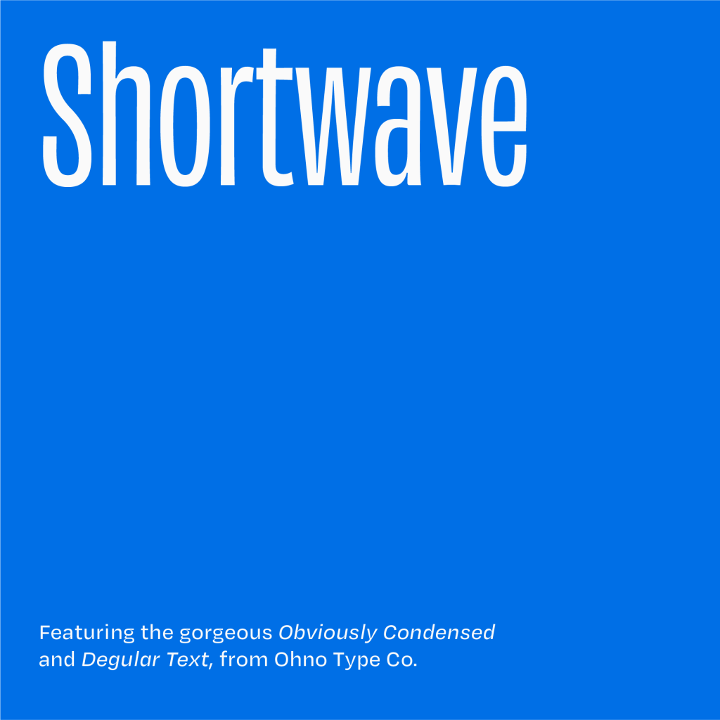
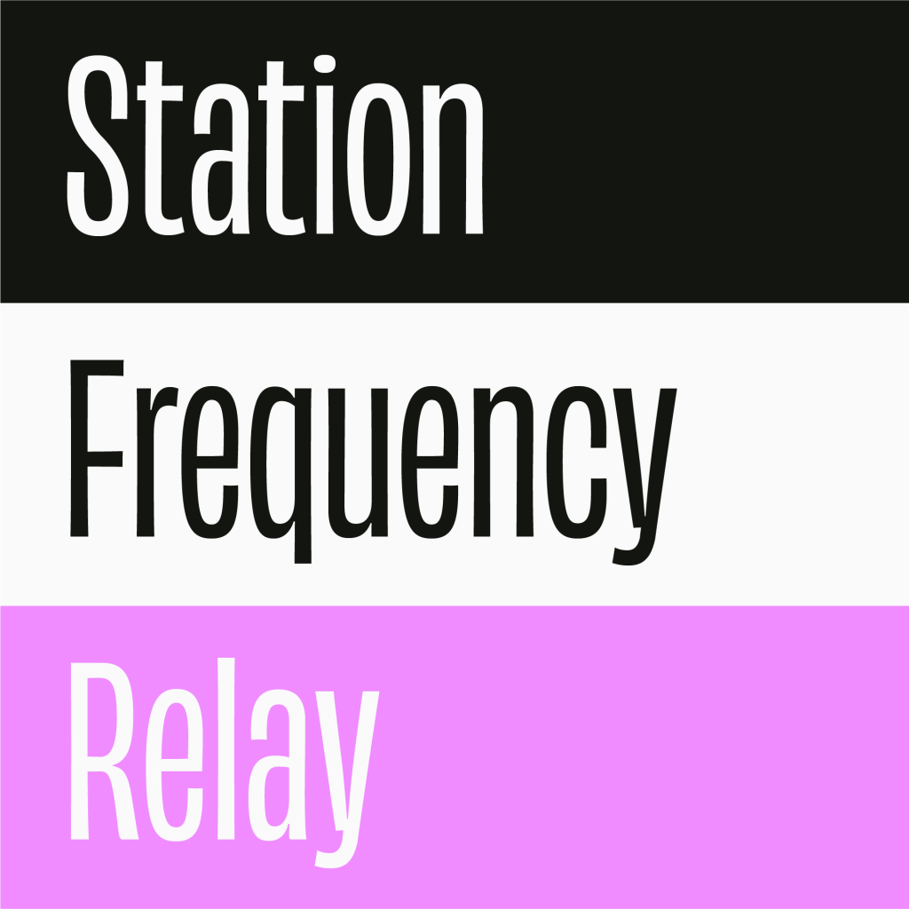
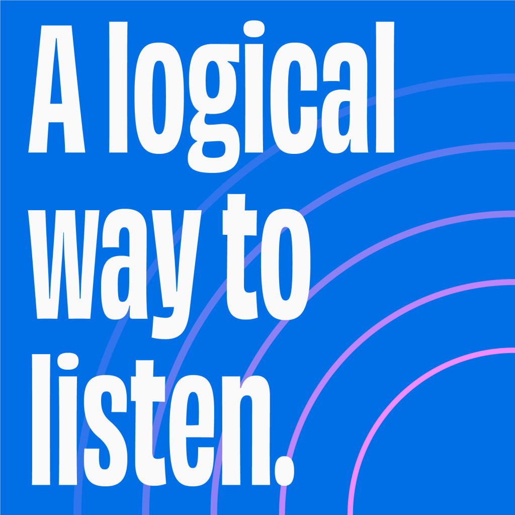
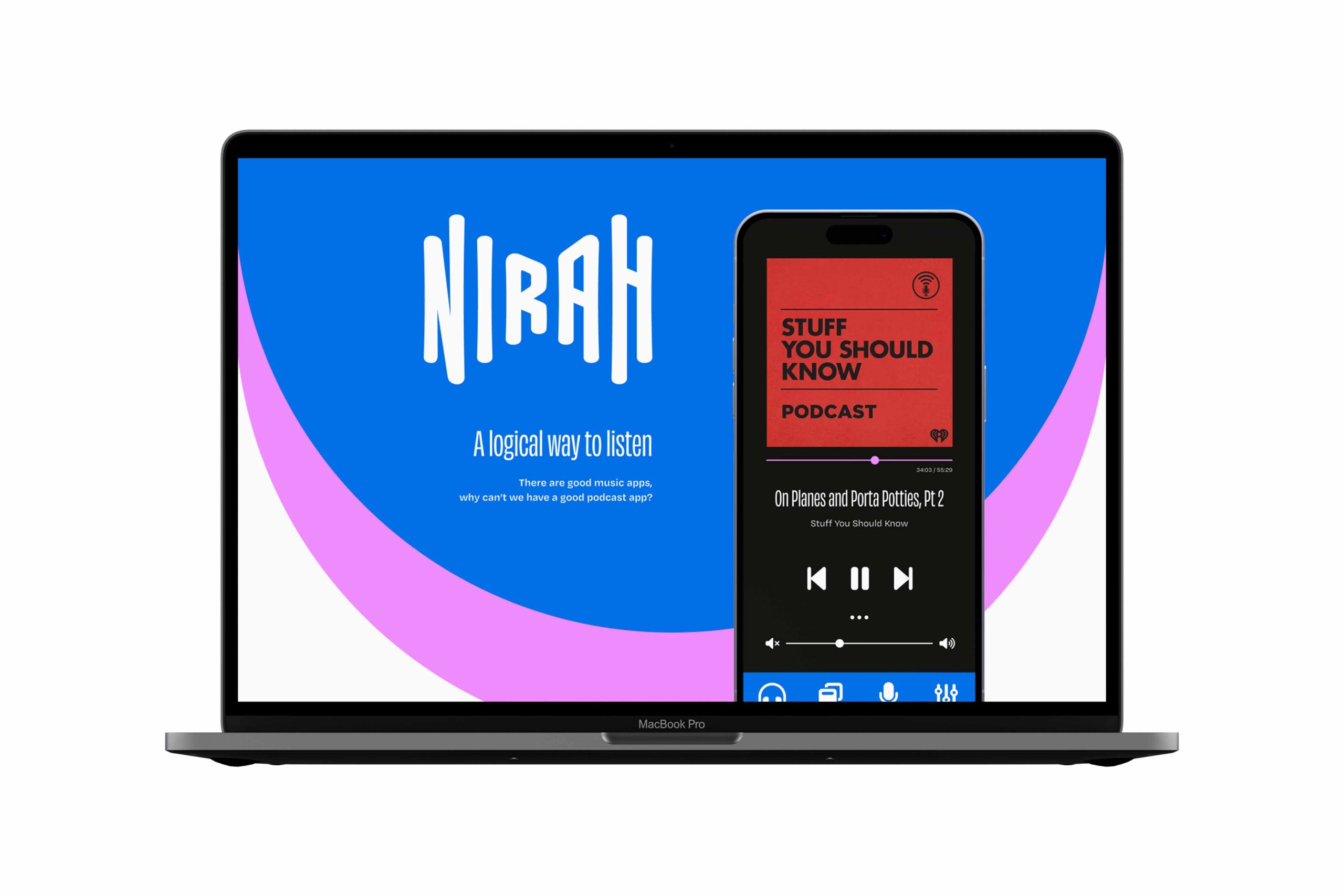
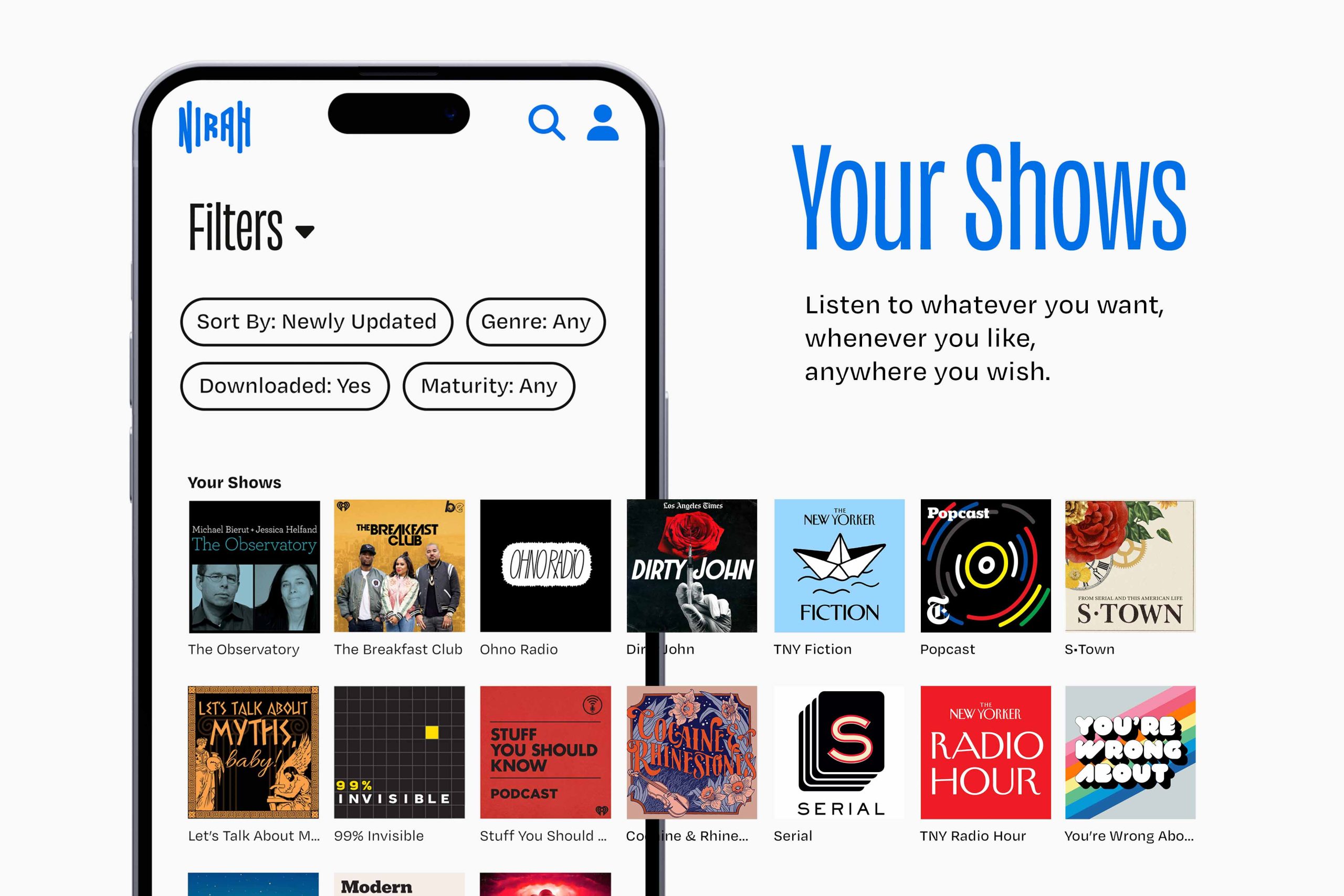
Nirah is a podcast app that puts the listening experience first. The design is focused on getting you to the content you want in fewer steps. It allows for offline downloads, perfect for a busy lifestyle on the go. The logomark was inspired by audio waveforms and emulates repetition in speech. Shortwave blue and Relay pink call attention to important areas, while the stripped-back palette ensures that the content you love takes centre stage. The headers are set in Obviously Condensed since space on a phone app is limited.
![The Nirah logo with sound waves radiating from it.](https://reeselee.design/wp-content/uploads/2023/04/1-1.png)
![White letters on a blue background, that says "Shortwave".](https://reeselee.design/wp-content/uploads/2023/04/2-1-1024x1024.png)
![The names of brand colours, a black named "Station", a white named "Frequency", and a vivd pink named "Relay".](https://reeselee.design/wp-content/uploads/2023/04/3-1-1024x1024.png)
![A glossy blue glass podcast app icon for Nirah.](https://reeselee.design/wp-content/uploads/2023/04/App-Icon-web-1024x1024.jpg)
![White letters on a blue background, that says "A logical way to listen".](https://reeselee.design/wp-content/uploads/2023/04/4-2-1024x1024.png)
![A MacBook showing a promotional website for the Nirah podcast application.](https://reeselee.design/wp-content/uploads/2023/04/MacBook-Pro-16-Inch-Mockup-scaled.jpg)
![Phone screens with audio shows sliding out of the Nirah podcast app.](https://reeselee.design/wp-content/uploads/2023/04/showcase-1-shows-scaled.jpg)
![Phone screens showing Nirah's studio and creation features to edit audio.](https://reeselee.design/wp-content/uploads/2023/04/showcase-2-create-scaled.jpg)
![Albums spilling out of the Nirah podcast player.](https://reeselee.design/wp-content/uploads/2023/04/showcase-3-player-scaled.jpg)